Anchor Academy
custom logo
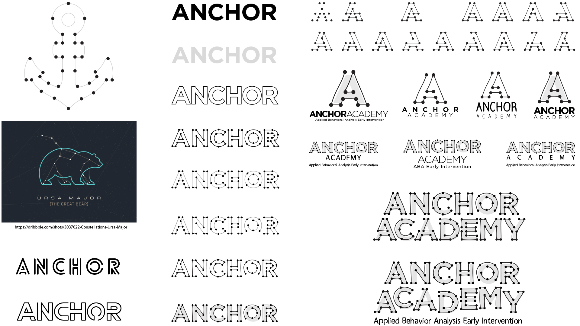
I presented the client three very distinct concepts, which all were well-received. “Connecting the Dots” was the concept that was chosen for its uniqueness. Even though the company currently focuses on teaching children diagnosed with autism between the ages of 18 months to 5 years old, the logo has longevity and is flexible enough to still represent the core values if the age range expands as the company grows.
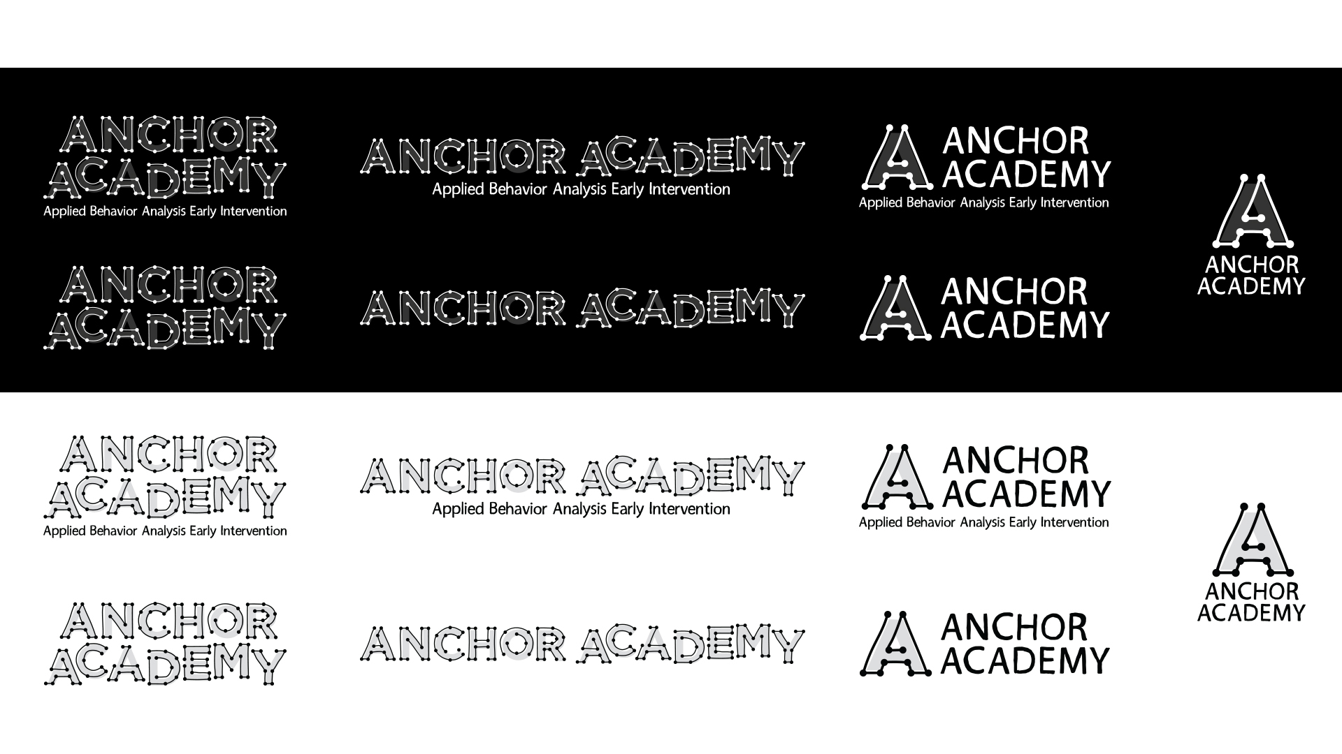
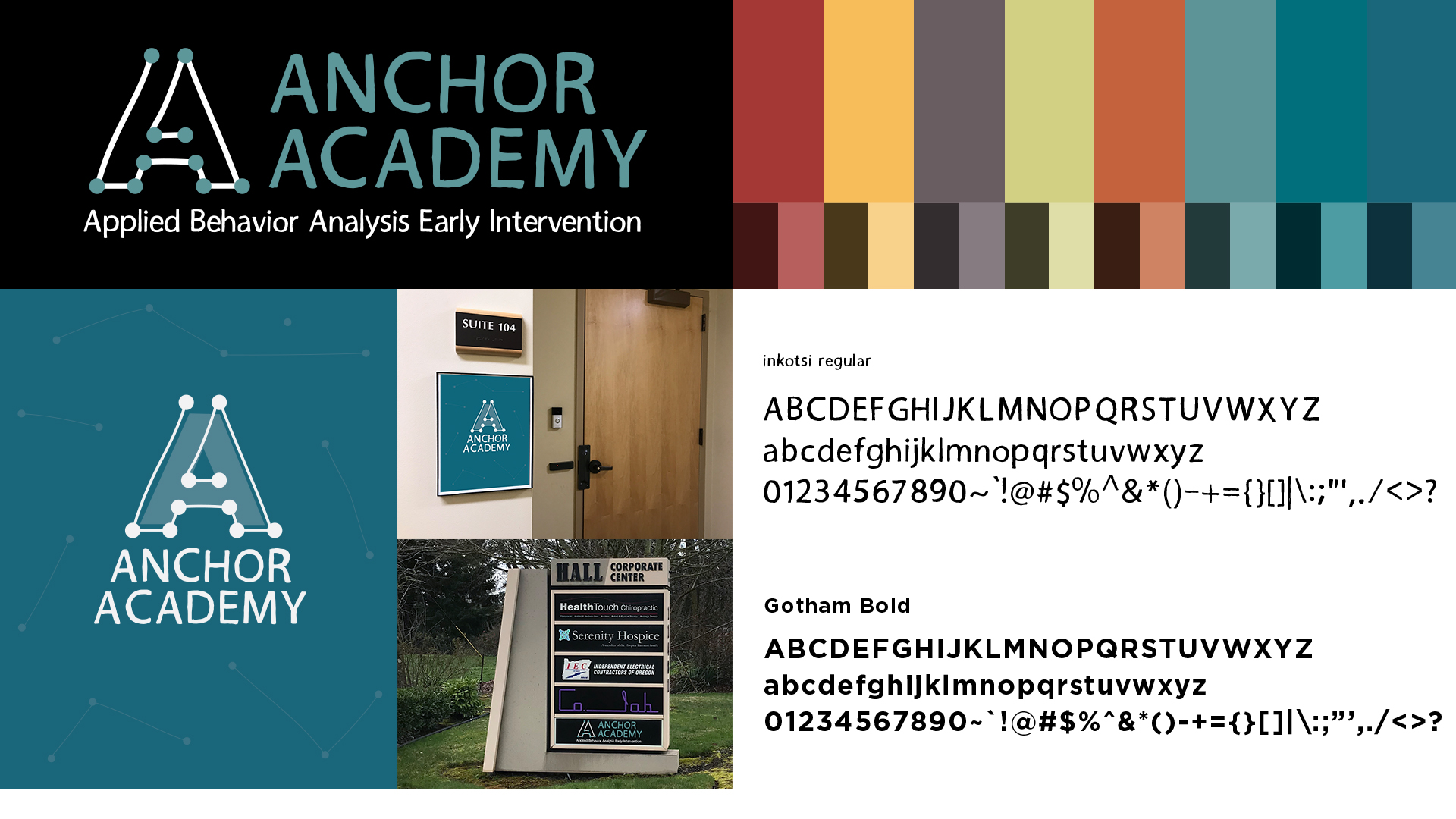
RATIONALE: Connecting the dots originated from a game of connecting numbered dots to reveal a picture or drawing. Circles/dots represent wholeness. Think of the dots as anchors or stars, which are the foundation to build upon and they are used to guide the way. The academy helps the child and parent discover the connections and see the big picture (skills and foundations for success in life). Each child is unique, so there is no single solution or way to connect the dots. (There are three A’s in ANCHOR ACADEMY. Each of the A’s are connected differently.) The ANCHOR part of the wordmark all aligns to the baseline (reinforcing foundation) as a cue to being grounded in strength and stability rather than the use of an actual anchor, which is expected. The ACADEMY part is a little more dynamic visually. It helps inject a little personality and whimsy to an otherwise static feeling logo. The typeface chosen for the tagline is set in a handwritten typeface, which compliments the wordmark. The tagline is set in upper and lower case for better readability. The combined wordmark overall is modern and professional, but not corporate.
- research
- concept
- design
- illustration
- production