Nike
RE+FT logo and header graphics
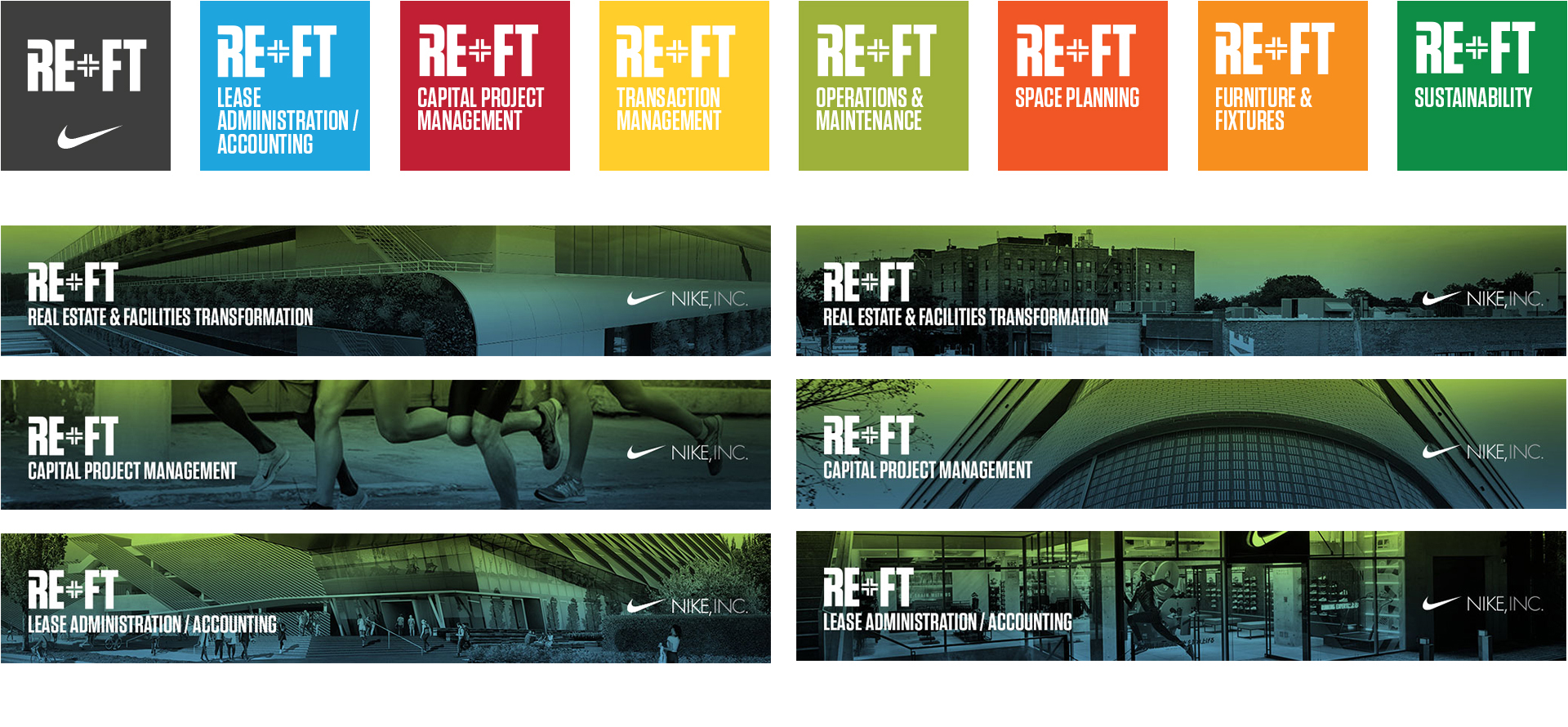
The existing IWMS (Integrated Workplace Management System) was merging. The newly named Real Estate and Facilities Transformation (REFT) global enterprise tool is the unification of disparate systems and manual processes into one technology platform.
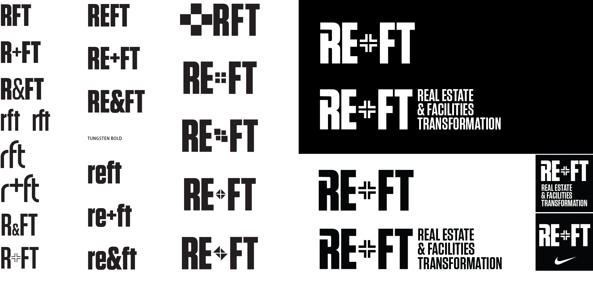
“Real Estate and Facilities Transformation” is a mouthful and a lot to type, so it was an easy decision to work with the acronym REFT. A bold condensed san serif typeface was chosen for its clean and simple forms. The plus (+) was chosen over the ampersand (&) because of the visual form. The manipulated “+” infers transformation. The open “R” is not only to add visual interest to the letterform, but it also suggests construction and building. The other letters (EFT) do not have a counterspace, so the idea was to create a feeling of unification. The idea is to have the “umbrella” tool (REFT) be black or a dark charcoal color to distiguish it from the components. Each component has their own designated color.
- concept
- design
- image search